- Bar:柱状图/条形图
- Bar - Bar_base
- Bar - Bar_reversal_axis
- Bar - Bar_xyaxis_name
- Bar - Bar_different_series_gap
- Bar - Bar_same_series_gap
- Bar - Bar_histogram
- Bar - Bar_waterfall_plot
- Bar - Bar_markline_custom
- Bar - Bar_markline_type
- Bar - Bar_markpoint_custom
- Bar - Bar_stack0
- Bar - Bar_stack1
- Bar - Stack_bar_percent
- Bar - Multiple_y_axes
- Bar - Mixed_bar_and_line
- Bar - Bar_yaxis_formatter
- Bar - Bar_rotate_xaxis_label
- Bar - Bar_base_dict_config
- Bar - Bar_is_selected
- Bar - Bar_datazoom_slider
- Bar - Bar_datazoom_slider_vertical
- Bar - Bar_datazoom_inside
- Bar - Bar_datazoom_both
- Bar - Bar_with_brush
- Bar - Bar_toolbox
- Bar - Bar_base_with_custom_background_image
- Bar - Bar_base_with_animation
柱状图/条形图
参考框架(有待完善)
bar = (
    Bar(init_opts=opts.InitOpts(height='400px', width='800px')# 初始化设置
       )
    .add_xaxis(main_pol.index.tolist())
    .add_yaxis("", main_pol.values.tolist(),
               color='#130f40', # 设置柱体的颜色
               category_gap=20,
               # 点标记
               markpoint_opts=opts.MarkPointOpts(
                   data=[opts.MarkPointItem(type_='min', name='最小值')]),  # 也可以自定义标记点
               # 线标记
               markline_opts=opts.MarkLineOpts(
                   data=[opts.MarkLineItem(type_="max", name='最大值')]) #也可以自定义标记线
               )
    .set_global_opts(
        # 设置标题等信息
        title_opts=opts.TitleOpts(title="全国城市首要污染物", subtitle='2019年2月5日凌晨2点'),

        # 设置 x 轴刻度标签参数
        xaxis_opts=opts.AxisOpts(name='我是 x 轴',
                                 axislabel_opts=opts.LabelOpts(font_size=16)),

        # 设置 x 轴刻度标签参数
        yaxis_opts=opts.AxisOpts(name='我是 y 轴', name_gap=10, name_rotate=90, name_location='left',

                                 axislabel_opts=opts.LabelOpts(),  # 刻度标签设置
                                 # axistick_opts=opts.AxisTickOpts() # 刻度设置
                                 ),
        legend_opts=opts.LabelOpts(position="",
                                   orient="")

    )


    .set_series_opts(label_opts=opts.LabelOpts(font_size=14) #设置数据标签

                    )
)
Bar:柱状图/条形图
class pyecharts.charts.Bar(RectChart)
class Bar(
    # 初始化配置项,参考 `global_options.InitOpts`
    init_opts: opts.InitOpts = opts.InitOpts()
)
func pyecharts.charts.Bar.add_yaxis
def add_yaxis(
    # 系列名称,用于 tooltip 的显示,legend 的图例筛选。
    series_name: str,

    # 系列数据
    y_axis: Sequence[Numeric, opts.BarItem, dict],

    # 是否选中图例
    is_selected: bool = True,

    # 使用的 x 轴的 index,在单个图表实例中存在多个 x 轴的时候有用。
    xaxis_index: Optional[Numeric] = None,

    # 使用的 y 轴的 index,在单个图表实例中存在多个 y 轴的时候有用。
    yaxis_index: Optional[Numeric] = None,

    # 系列 label 颜色
    color: Optional[str] = None,

    # 数据堆叠,同个类目轴上系列配置相同的 stack 值可以堆叠放置。
    stack: Optional[str] = None,

    # 同一系列的柱间距离,默认为类目间距的 20%,可设固定值
    category_gap: Union[Numeric, str] = "20%",

    # 不同系列的柱间距离,为百分比(如 '30%',表示柱子宽度的 30%)。
    # 如果想要两个系列的柱子重叠,可以设置 gap 为 '-100%'。这在用柱子做背景的时候有用。
    gap: Optional[str] = None,

    # 标签配置项,参考 `series_options.LabelOpts`
    label_opts: Union[opts.LabelOpts, dict] = opts.LabelOpts(),

    # 标记点配置项,参考 `series_options.MarkPointOpts`
    markpoint_opts: Union[opts.MarkPointOpts, dict, None] = None,

    # 标记线配置项,参考 `series_options.MarkLineOpts`
    markline_opts: Union[opts.MarkLineOpts, dict, None] = None,

    # 提示框组件配置项,参考 `series_options.TooltipOpts`
    tooltip_opts: Union[opts.TooltipOpts, dict, None] = None,

    # 图元样式配置项,参考 `series_options.ItemStyleOpts`
    itemstyle_opts: Union[opts.ItemStyleOpts, dict, None] = None,

    # 可以定义 data 的哪个维度被编码成什么。
    encode: types.Union[types.JSFunc, dict, None] = None,
)
BarItem:柱状图数据项
class BarItem(
    # 数据项名称。
    name: Optional[str] = None,

    # 单个数据项的数值。
    value: Optional[Numeric] = None,

    # 单个柱条文本的样式设置,参考 `series_options.LabelOpts`。
    label_opts: Union[LabelOpts, dict, None] = None,

    # 图元样式配置项,参考 `series_options.ItemStyleOpts`
    itemstyle_opts: Union[ItemStyleOpts, dict, None] = None,

    # 提示框组件配置项,参考 `series_options.TooltipOpts`
    tooltip_opts: Union[TooltipOpts, dict, None] = None,
)
Bar - Bar_base
from pyecharts import options as opts
from pyecharts.charts import Bar
from pyecharts.faker import Faker


c = (
    Bar()
    .add_xaxis(Faker.choose())
    .add_yaxis("商家A", Faker.values())
    .add_yaxis("商家B", Faker.values())
    .set_global_opts(title_opts=opts.TitleOpts(title="Bar-基本示例", subtitle="我是副标题"))
    .render("bar_base.html")
)

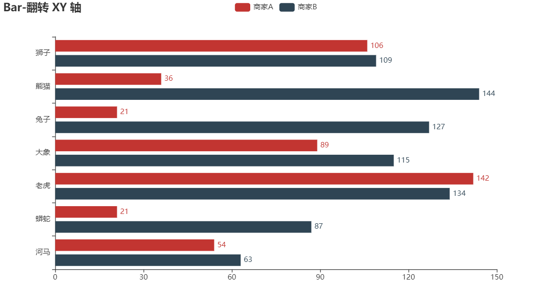
Bar - Bar_reversal_axis
from pyecharts import options as opts
from pyecharts.charts import Bar
from pyecharts.faker import Faker

c = (
    Bar()
    .add_xaxis(Faker.choose())
    .add_yaxis("商家A", Faker.values())
    .add_yaxis("商家B", Faker.values())
    .reversal_axis()
    .set_series_opts(label_opts=opts.LabelOpts(position="right"))
    .set_global_opts(title_opts=opts.TitleOpts(title="Bar-翻转 XY 轴"))
    .render("bar_reversal_axis.html")
)
Bar - Bar_xyaxis_name
from pyecharts import options as opts
from pyecharts.charts import Bar
from pyecharts.faker import Faker


c = (
    Bar()
    .add_xaxis(Faker.choose())
    .add_yaxis("商家A", Faker.values())
    .add_yaxis("商家B", Faker.values())
    .set_global_opts(
        title_opts=opts.TitleOpts(title="Bar-XY 轴名称"),
        yaxis_opts=opts.AxisOpts(name="我是 Y 轴"),
        xaxis_opts=opts.AxisOpts(name="我是 X 轴"),
    )
    .render("bar_xyaxis_name.html")
)

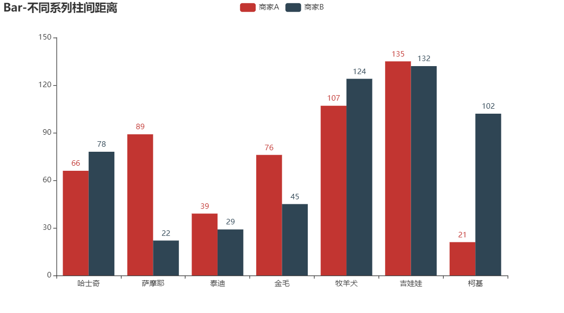
Bar - Bar_different_series_gap
from pyecharts import options as opts
from pyecharts.charts import Bar
from pyecharts.faker import Faker


c = (
    Bar()
    .add_xaxis(Faker.choose())
    .add_yaxis("商家A", Faker.values(), gap="0%")
    .add_yaxis("商家B", Faker.values(), gap="0%")
    .set_global_opts(title_opts=opts.TitleOpts(title="Bar-不同系列柱间距离"))
    .render("bar_different_series_gap.html")
)
Bar - Bar_same_series_gap
from pyecharts import options as opts
from pyecharts.charts import Bar
from pyecharts.faker import Faker


c = (
    Bar()
    .add_xaxis(Faker.choose())
    .add_yaxis("商家A", Faker.values(), category_gap="80%")
    .set_global_opts(title_opts=opts.TitleOpts(title="Bar-单系列柱间距离"))
    .render("bar_same_series_gap.html")
)

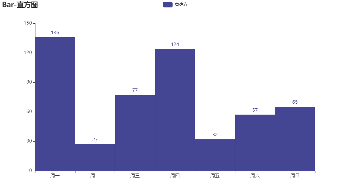
Bar - Bar_histogram
from pyecharts import options as opts
from pyecharts.charts import Bar
from pyecharts.faker import Faker

c = (
    Bar()
    .add_xaxis(Faker.choose())
    .add_yaxis("商家A", Faker.values(), category_gap=0, color=Faker.rand_color())
    .set_global_opts(title_opts=opts.TitleOpts(title="Bar-直方图"))
    .render("bar_histogram.html")
)
Bar - Bar_waterfall_plot
from pyecharts.charts import Bar
from pyecharts import options as opts

x_data = [f"11月{str(i)}日" for i in range(1, 12)]
y_total = [0, 900, 1245, 1530, 1376, 1376, 1511, 1689, 1856, 1495, 1292]
y_in = [900, 345, 393, "-", "-", 135, 178, 286, "-", "-", "-"]
y_out = ["-", "-", "-", 108, 154, "-", "-", "-", 119, 361, 203]


bar = (
    Bar()
    .add_xaxis(xaxis_data=x_data)
    .add_yaxis(
        series_name="",
        yaxis_data=y_total,
        stack="总量",
        # 颜色为白色
        itemstyle_opts=opts.ItemStyleOpts(color="rgba(0,0,0,0)"),
    )
    .add_yaxis(series_name="收入", yaxis_data=y_in, stack="总量")
    .add_yaxis(series_name="支出", yaxis_data=y_out, stack="总量")
    .set_global_opts(yaxis_opts=opts.AxisOpts(type_="value"))
    .render("bar_waterfall_plot.html")
)

Bar - Bar_markline_custom
from pyecharts import options as opts
from pyecharts.charts import Bar
from pyecharts.faker import Faker

c = (
    Bar()
    .add_xaxis(Faker.choose())
    .add_yaxis('商家A', Faker.values())
    .add_yaxis("商家B", Faker.values())
    .set_global_opts(title_opts=opts.TitleOpts(title="Bar-基本示例", subtitle="我是副标题"))
    .set_series_opts(
        label_opts=opts.LabelOpts(is_show=False),  # 设置 False 将不显示具体的数字
        markline_opts=opts.MarkLineOpts(
            data=[opts.MarkLineItem(y=50, name='yAxis=50')]
        )
    )
    .render("base.html")

)

Bar - Bar_markline_type
from pyecharts import options as opts
from pyecharts.charts import Bar
from pyecharts.faker import Faker

c = (
    Bar()
    .add_xaxis(Faker.choose())
    .add_yaxis("商家A", Faker.values())
    .add_yaxis("商家B", Faker.values())
    .set_global_opts(title_opts=opts.TitleOpts(title="Bar-MarkLine(指定类型)"))
    .set_series_opts(
        label_opts=opts.LabelOpts(is_show=False),
        markline_opts=opts.MarkLineOpts(
            data=[
                opts.MarkLineItem(type_="min", name="最小值"),
                opts.MarkLineItem(type_="max", name="最大值"),
                opts.MarkLineItem(type_="average", name="平均值"),
            ]
        ),
    )
)

Bar - Bar_markpoint_custom
from pyecharts import options as opts
from pyecharts.charts import Bar
from pyecharts.faker import Faker

x, y = Faker.choose(), Faker.values()
c = (
    Bar()
    .add_xaxis(x)
    .add_yaxis(
        "商家A",
        y,
        markpoint_opts=opts.MarkPointOpts(
            data=[opts.MarkPointItem(name="自定义标记点",
                                     coord=[x[2], y[2]],
                                     value=y[2])]
        ),
    )
    .add_yaxis("商家B", Faker.values())
    .set_global_opts(title_opts=opts.TitleOpts(title="Bar-MarkPoint(自定义)"))
    .set_series_opts(label_opts=opts.LabelOpts(is_show=False))
    .render("bar_markpoint_custom.html")
)

Bar - Bar_stack0
from pyecharts import options as opts
from pyecharts.charts import Bar
from pyecharts.faker import Faker

c = (
    Bar()
    .add_xaxis(Faker.choose())
    .add_yaxis("商家A", Faker.values(), stack='stack1')
    .add_yaxis("商家B", Faker.values(), stack='stack1')
    .set_global_opts(title_opts=opts.TitleOpts(title="Bar-堆叠数据(全部)"))
    .set_series_opts(label_opts=opts.LabelOpts(is_show=False))
    .render("bar_stack0.html")
)

Bar - Bar_stack1
from pyecharts import options as opts
from pyecharts.charts import Bar
from pyecharts.faker import Faker

c = (
    Bar()
    .add_xaxis(Faker.choose())
    .add_yaxis("商家A", Faker.values(), stack='stack1')
    .add_yaxis("商家B", Faker.values(), stack='stack1')
    .add_yaxis("商家C", Faker.values())

    .set_global_opts(title_opts=opts.TitleOpts(title="Bar-堆叠数据(部分)"))
    .set_series_opts(label_opts=opts.LabelOpts(is_show=False))
    .render("bar_stack1.html")

)

Bar - Stack_bar_percent
from pyecharts import options as opts
from pyecharts.charts import Bar
from pyecharts.commons.utils import JsCode
from pyecharts.globals import ThemeType

list2 = [
    {"value": 12, "percent": 12 / (12 + 3)},
    {"value": 23, "percent": 23 / (23 + 21)},
    {"value": 33, "percent": 33 / (33 + 5)},
    {"value": 3, "percent": 3 / (3 + 52)},
    {"value": 33, "percent": 33 / (33 + 43)},
]

list3 = [
    {"value": 3, "percent": 3 / (12 + 3)},
    {"value": 21, "percent": 21 / (23 + 21)},
    {"value": 5, "percent": 5 / (33 + 5)},
    {"value": 52, "percent": 52 / (3 + 52)},
    {"value": 43, "percent": 43 / (33 + 43)},
]

c = (
    Bar(init_opts=opts.InitOpts(theme=ThemeType.LIGHT))
    .add_xaxis([1, 2, 3, 4, 5])
    .add_yaxis("product1", list2, stack='stack1', category_gap="50%")
    .add_yaxis('product2', list3, stack='stack1', category_gap="50%")

    .set_series_opts(
        label_opts=opts.LabelOpts(
            position='right',


        )
    )
    .render('stack_bar_percent.html')
)

修改代码:
    .set_series_opts(
        label_opts=opts.LabelOpts(
            position='right',
            formatter=JsCode(
                "function(x){return Number(x.data.percent * 100).toFixed() + '%';}"
            ),

        )
    )

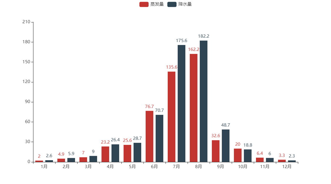
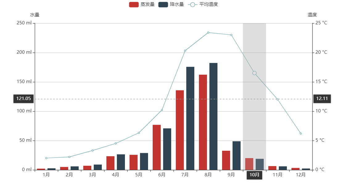
Bar - Multiple_y_axes
import pyecharts.options as opts
from pyecharts.charts import Bar, Line


colors = ["#5793f3", "#d14a61", "#675bba"]
x_data = ["1月", "2月", "3月", "4月", "5月", "6月", "7月", "8月", "9月", "10月", "11月", "12月"]
legend_list = ["蒸发量", "降水量", "平均温度"]
evaporation_capacity = [
    2.0,
    4.9,
    7.0,
    23.2,
    25.6,
    76.7,
    135.6,
    162.2,
    32.6,
    20.0,
    6.4,
    3.3,
]
rainfall_capacity = [
    2.6,
    5.9,
    9.0,
    26.4,
    28.7,
    70.7,
    175.6,
    182.2,
    48.7,
    18.8,
    6.0,
    2.3,
]
average_temperature = [2.0, 2.2, 3.3, 4.5, 6.3, 10.2, 20.3, 23.4, 23.0, 16.5, 12.0, 6.2]

bar = (
    Bar(init_opts=opts.InitOpts(width="1200px", height="800px"))
    .add_xaxis(xaxis_data=x_data)
    .add_yaxis(
        series_name="蒸发量",
        yaxis_data=evaporation_capacity,
        yaxis_index=0,
        color=colors[1],
    )
    .add_yaxis(
        series_name="降水量",
        yaxis_data=rainfall_capacity,
        yaxis_index=1,
        color=colors[0]
    )
    # 新增y坐标轴配置项: 因为有三个纵轴数据, 包括蒸发量/降水量(单位是ml), 平均温度(单位是°C)
    .extend_axis(
        yaxis=opts.AxisOpts(
            name="蒸发量",
            type_="value",
            min_=0,
            max_=250,
            position="right",
            axisline_opts=opts.AxisLineOpts(
                linestyle_opts=opts.LineStyleOpts(color=colors[1])
            ),
            axislabel_opts=opts.LabelOpts(formatter="{value} ml"),
        )
    )
    .extend_axis(
        yaxis=opts.AxisOpts(
            type_="value",
            name="温度",
            min_=0,
            max_=25,
            position="left",
            axisline_opts=opts.AxisLineOpts(
                linestyle_opts=opts.LineStyleOpts(color=colors[2])
            ),
            axislabel_opts=opts.LabelOpts(formatter="{value} °C"),
            splitline_opts=opts.SplitLineOpts(
                is_show=True, linestyle_opts=opts.LineStyleOpts(opacity=1)
            ),
        )
    )
    .set_global_opts(
        yaxis_opts=opts.AxisOpts(
            type_="value",
            name="降水量",
            # name_location="center",
            # name_gap=60,
            # name_textstyle_opts=opts.TextStyleOpts(color='white')
            min_=0,
            max_=250,
            position="right",
            offset=80,
            axisline_opts=opts.AxisLineOpts(
                linestyle_opts=opts.LineStyleOpts(color=colors[0])
            ),
            axislabel_opts=opts.LabelOpts(formatter="{value} ml"),
        ),
        tooltip_opts=opts.TooltipOpts(trigger="axis", axis_pointer_type="cross"),
    )
)

line = (
    Line()
    .add_xaxis(xaxis_data=x_data)
    .add_yaxis(
        series_name="平均温度",
        y_axis=average_temperature,
        yaxis_index=2,
        color=colors[2]
    )
)
# 使用层叠组件组合图形
bar.overlap(line).render("multiple_y_axes.html")

Bar - Mixed_bar_and_line
x_data = ["{}月".format(i) for i in range(1, 13)]
zengfaliang = [2.0, 4.9, 7.0, 23.2, 25.6,
               76.7, 135.6, 162.2, 32.6, 20.0, 6.4, 3.3]
jiangshuiliang = [2.6, 5.9, 9.0, 26.4, 28.7,
                  70.7, 175.6, 182.2, 48.7, 18.8, 6.0, 2.3]
average_wendu = [2.0, 2.2, 3.3, 4.5, 6.3,
                 10.2, 20.3, 23.4, 23.0, 16.5, 12.0, 6.2]

bar = Bar()

line = Line()

bar.add_xaxis(x_data)
bar.add_yaxis("蒸发量", zengfaliang)
bar.add_yaxis("降水量", jiangshuiliang)
bar.set_global_opts(title_opts=opts.TitleOpts("Grid-多Y轴展示"), tooltip_opts=opts.TooltipOpts(trigger="axis", axis_pointer_type="cross")  # 交叉指向工具
                    )
bar.extend_axis(yaxis=opts.AxisOpts(type_="value",
                                    name="温度",
                                    min_=0,
                                    max_=25,
                                    position="right",
                                    axislabel_opts=opts.LabelOpts(
                                        formatter="{value} °C"),
                                    ))
# 在bar上增加Y轴,在line图上选择对应的轴向
line.add_xaxis(x_data)
line.add_yaxis("平均温度", average_wendu, yaxis_index=1)
# 把line添加到bar上
bar.overlap(line)
bar.render('opop.html')

默认的 y 轴 ,index 为 0,若需要多个 y 轴,需要使用.extend_axis 进行扩展
x_data = ["{}月".format(i) for i in range(1, 13)]
zengfaliang = [2.0, 4.9, 7.0, 23.2, 25.6,
               76.7, 135.6, 162.2, 32.6, 20.0, 6.4, 3.3]
jiangshuiliang = [2.6, 5.9, 9.0, 26.4, 28.7,
                  70.7, 175.6, 182.2, 48.7, 18.8, 6.0, 2.3]
average_wendu = [2.0, 2.2, 3.3, 4.5, 6.3,
                 10.2, 20.3, 23.4, 23.0, 16.5, 12.0, 6.2]

bar = Bar()

line = Line()

bar.add_xaxis(x_data)
bar.add_yaxis("蒸发量", zengfaliang)
bar.add_yaxis("降水量", jiangshuiliang)
x_data = ["1月", "2月", "3月", "4月", "5月", "6月", "7月", "8月", "9月", "10月", "11月", "12月"]

bar = (
    Bar(init_opts=opts.InitOpts())
    .add_xaxis(xaxis_data=x_data)
    .add_yaxis(
        series_name="蒸发量",
        yaxis_data=[2.0, 4.9,7.0,23.2,25.6,76.7,135.6,162.2,32.6,20.0,6.4,3.3],
        label_opts=opts.LabelOpts(is_show=False),
    )
    .add_yaxis(
        series_name="降水量",
        yaxis_data=[2.6,5.9,9.0,26.4,28.7,70.7,175.6,182.2,48.7,18.8,6.0,2.3],
        label_opts=opts.LabelOpts(is_show=False),
    )
    .extend_axis(
        yaxis=opts.AxisOpts(
            name="温度",
            type_="value",
            min_=0,
            max_=25,
            interval=5,
            axislabel_opts=opts.LabelOpts(formatter="{value} °C"),
        )
    )
    .set_global_opts(
        tooltip_opts=opts.TooltipOpts(
            is_show=True, trigger="axis", axis_pointer_type="cross"
        ),
        xaxis_opts=opts.AxisOpts(
            type_="category",
            axispointer_opts=opts.AxisPointerOpts(is_show=True, type_="shadow"),
        ),
        yaxis_opts=opts.AxisOpts(
            name="水量",
            type_="value",
            min_=0,
            max_=250,
            interval=50,
            axislabel_opts=opts.LabelOpts(formatter="{value} ml"),
            axistick_opts=opts.AxisTickOpts(is_show=True),
            splitline_opts=opts.SplitLineOpts(is_show=True),
        ),
    )
)

line = (
    Line()
    .add_xaxis(xaxis_data=x_data)
    .add_yaxis(
        series_name="平均温度",
        yaxis_index=1,
        y_axis=[2.0, 2.2, 3.3, 4.5, 6.3, 10.2, 20.3, 23.4, 23.0, 16.5, 12.0, 6.2],
        label_opts=opts.LabelOpts(is_show=False),
    )
)

bar.overlap(line).render("mixed_bar_and_line.html")
Bar - Bar_yaxis_formatter
c = (
    Bar()
    .add_xaxis(Faker.choose())
    .add_yaxis("商家A",Faker.values())
    .add_yaxis("商家B",Faker.values())
    .set_global_opts(
        title_opts=opts.TitleOpts(title="Bar-Y 轴 formatter"),
        yaxis_opts=opts.AxisOpts(
            axislabel_opts=opts.LabelOpts(formatter="{value}/月")
            )
        )
    .render("bar_yaxis_formatter.html")
)

Bar - Bar_rotate_xaxis_label
from pyecharts import options as opts
from pyecharts.charts import Bar

c = (
    Bar()
    .add_xaxis(
        [
            "名字很长的X轴标签1",
            "名字很长的X轴标签2",
            "名字很长的X轴标签3",
            "名字很长的X轴标签4",
            "名字很长的X轴标签5",
            "名字很长的X轴标签6",
        ]
    )
    .add_yaxis("商家A", [10, 20, 30, 40, 50, 40])
    .add_yaxis("商家B", [20, 10, 40, 30, 40, 50])
    .set_global_opts(
        xaxis_opts=opts.AxisOpts(axislabel_opts=opts.LabelOpts(rotate=-15)),
        title_opts=opts.TitleOpts(title="Bar-旋转X轴标签", subtitle="解决标签名字过长的问题"),
    )
    .render("bar_rotate_xaxis_label.html")
)

Bar - Bar_base_dict_config
from pyecharts.charts import Bar
from pyecharts.faker import Faker
from pyecharts.globals import ThemeType

c = (
    Bar({"theme": ThemeType.MACARONS})
    .add_xaxis(Faker.choose())
    .add_yaxis("商家A", Faker.values())
    .add_yaxis("商家B", Faker.values())
    .set_global_opts(
        title_opts={"text": "Bar-通过 dict 进行配置", "subtext": "我也是通过 dict 进行配置的"}
    )
    .render("bar_base_dict_config.html")
)

Bar - Bar_is_selected
from pyecharts import options as opts
from pyecharts.charts import Bar
from pyecharts.faker import Faker


c = (
    Bar()
    .add_xaxis(Faker.choose())
    .add_yaxis("商家A", Faker.values())
    .add_yaxis("商家B", Faker.values(), is_selected=False)
    .set_global_opts(title_opts=opts.TitleOpts(title="Bar-默认取消显示某 Series"))
    .render("bar_is_selected.html")
)

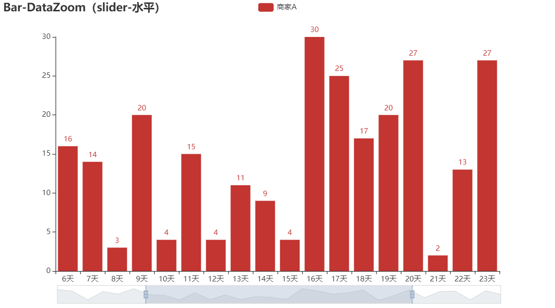
Bar - Bar_datazoom_slider
from pyecharts import options as opts
from pyecharts.charts import Bar
from pyecharts.faker import Faker

c = (
    Bar()
    .add_xaxis(Faker.days_attrs)
    .add_yaxis("商家A", Faker.days_values)
    .set_global_opts(
        title_opts=opts.TitleOpts(title="Bar-DataZoom(slider-水平)"),
        datazoom_opts=opts.DataZoomOpts(),
    )
    .render("bar_datazoom_slider.html")
)
Bar - Bar_datazoom_slider_vertical
from pyecharts import options as opts
from pyecharts.charts import Bar
from pyecharts.faker import Faker

c = (
    Bar()
    .add_xaxis(Faker.days_attrs)
    .add_yaxis("商家A", Faker.days_values, color=Faker.rand_color())
    .set_global_opts(
        title_opts=opts.TitleOpts(title="Bar-DataZoom(slider-垂直)"),
        datazoom_opts=opts.DataZoomOpts(orient="vertical"),
    )
    .render("bar_datazoom_slider_vertical.html")
)

Bar - Bar_datazoom_inside
from pyecharts import options as opts
from pyecharts.charts import Bar
from pyecharts.faker import Faker

c = (
    Bar()
    .add_xaxis(Faker.days_attrs)
    .add_yaxis("商家A", Faker.days_values, color=Faker.rand_color())
    .set_global_opts(
        title_opts=opts.TitleOpts(title="Bar-DataZoom(inside)"),
        datazoom_opts=opts.DataZoomOpts(type_="inside"),
    )
    .render("bar_datazoom_inside.html")
)

Bar - Bar_datazoom_both
from pyecharts import options as opts
from pyecharts.charts import Bar
from pyecharts.faker import Faker

c = (
    Bar()
    .add_xaxis(Faker.days_attrs)
    .add_yaxis("商家A", Faker.days_values, color=Faker.rand_color())
    .set_global_opts(
        title_opts=opts.TitleOpts(title="Bar-DataZoom(slider+inside)"),
        datazoom_opts=[opts.DataZoomOpts(), opts.DataZoomOpts(type_="inside")],
    )
    .render("bar_datazoom_both.html")
)

Bar - Bar_with_brush
from pyecharts import options as opts
from pyecharts.charts import Bar
from pyecharts.faker import Faker


c = (
    Bar()
    .add_xaxis(Faker.choose())
    .add_yaxis("商家A", Faker.values())
    .add_yaxis("商家B", Faker.values())
    .set_global_opts(
        title_opts=opts.TitleOpts(title="Bar-Brush示例", subtitle="我是副标题"),
        brush_opts=opts.BrushOpts(),
    )
    .render("bar_with_brush.html")
)

Bar - Bar_toolbox
from pyecharts import options as opts
from pyecharts.charts import Bar
from pyecharts.faker import Faker

c = (
    Bar()
    .add_xaxis(Faker.choose())
    .add_yaxis("商家A", Faker.values())
    .add_yaxis("商家B", Faker.values())
    .set_global_opts(
        title_opts=opts.TitleOpts(title="Bar-显示 ToolBox"),
        toolbox_opts=opts.ToolboxOpts(),
        legend_opts=opts.LegendOpts(is_show=False),
    )
    .render("bar_toolbox.html")
)

Bar - Bar_base_with_custom_background_image
from pyecharts import options as opts
from pyecharts.charts import Bar
from pyecharts.commons.utils import JsCode
from pyecharts.faker import Faker

c = (
    Bar(
        init_opts=opts.InitOpts(
            bg_color={"type": "pattern", "image": JsCode("img"), "repeat": "no-repeat"}
        )
    )
    .add_xaxis(Faker.choose())
    .add_yaxis("商家A", Faker.values())
    .add_yaxis("商家B", Faker.values())
    .set_global_opts(
        title_opts=opts.TitleOpts(
            title="Bar-背景图基本示例",
            subtitle="我是副标题",
            title_textstyle_opts=opts.TextStyleOpts(color="white"),
        )
    )
)
c.add_js_funcs(
    """
    var img = new Image(); img.src = 'https://s2.ax1x.com/2019/07/08/ZsS0fK.jpg';
    """
)
c.render("bar_base_with_custom_background_image.html")

Bar - Bar_base_with_animation
from pyecharts import options as opts
from pyecharts.charts import Bar
from pyecharts.faker import Faker


c = (
    Bar(
        init_opts=opts.InitOpts(
            animation_opts=opts.AnimationOpts(
                animation_delay=1000, animation_easing="elasticOut"
            )
        )
    )
    .add_xaxis(Faker.choose())
    .add_yaxis("商家A", Faker.values())
    .add_yaxis("商家B", Faker.values())
    .set_global_opts(title_opts=opts.TitleOpts(title="Bar-动画配置基本示例", subtitle="我是副标题"))
    .render("bar_base_with_animation.html")
)
